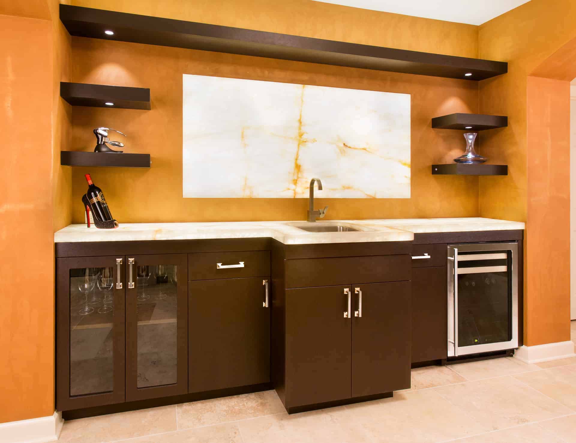
Contrast has boldness to it in any interpretation, so using contrasting colors in design reflects the more adventurous side of your personality.
Yet this approach can go wrong very quickly. Like an open bag of Lays potato chips, some people keep “having another” until the color combination is too busy or overdone. We know, it’s hard to have “just one.”
Here are some ideas on the most effective ways to use color and contrast in your custom storage design solutions:
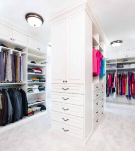
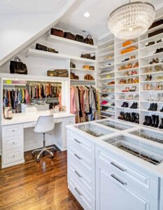
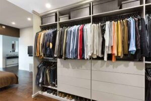
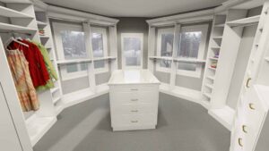
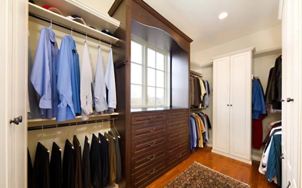
His Color and Her Color
This is a terrific way to divide a walk in closet. The area of the space that is “his” might be a dark wood tone; something masculine. The area of space that is “hers” could be white or a light tone. Then you’ve clearly defined the spaces and done so with style.
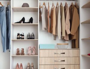
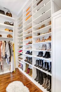
Function Leads The Way
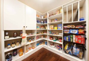
Selecting colors for specific cabinetry based upon how it will be used defines things quite well. Toys could be one color, books another and clothing something else. Your color choices could be “tone-on-tone”, meaning they are close to each other on the color wheel. Three or more contrasting colors is difficult to pull off and takes a very well trained eye to execute. 
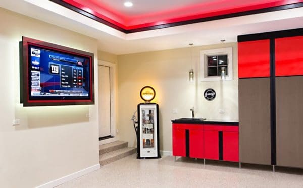
Accentuate the Positive
Another really great option is to choose one different color for an area to highlight. Perhaps it’s the TV cabinetry or the dresser drawers in a closet. Some would call this a “P.O.C.” (pop of color).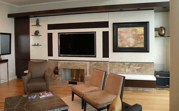
The Back End
Consider doing the backing in your cabinetry a different color as a terrific way to bring in some personality. You can also achieve this look with paint if you don’t have backing on your cabinetry or want a less permanent option.