Since we like being on the leading edge, we’re jumping ahead to 2014 to take a peak at what’s trending on the color horizon and how that translates into your home environment.
Color spurs emotion and creates atmosphere. It alters mood and impacts how we react to things, whether that’s clothing or room design.
So what kind of mood do you think the country is in? What colors will be seeing a bit of a resurgence and which are a new twist?
Experts from Sherwin Williams (https://www.sherwin-williams.com/) and the Pantone Color Institute (http://www.pantone.com) see the following:
Shades of Gray
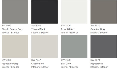
You’ll see more than 50 shades of gray and it has nothing to do with best sellers at Barnes & Noble. Gray in all its’ shades has been making its’ way back into environments for the past year and is coming on strong. Or muted, if you’re being literal.
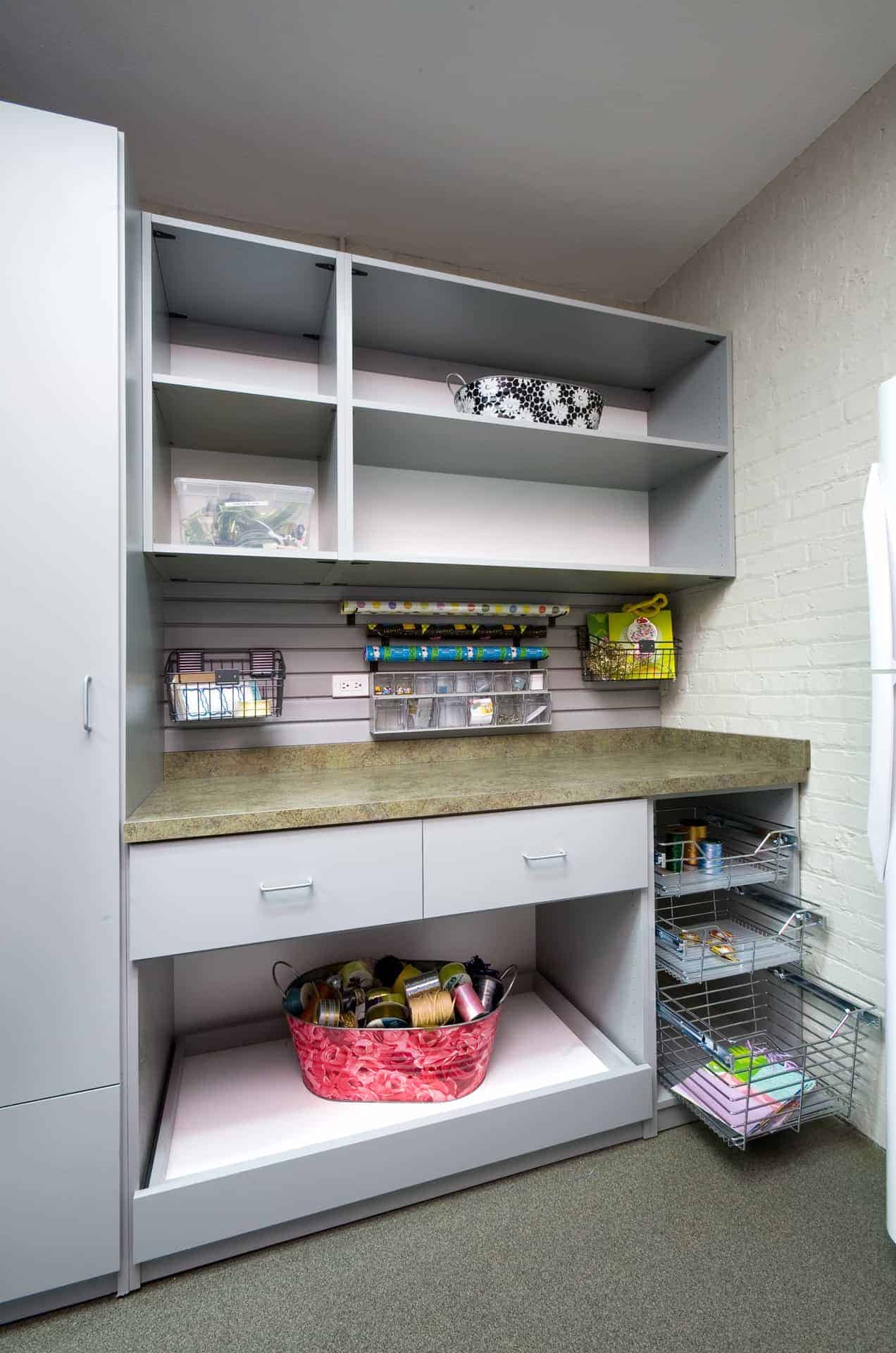
 he closet industry has had a standard gray melamine offering for decades (though sales have not been very robust in recent years). So if you’re really excited about this somewhat sedate color, you can do it very cost efficiently. And if you don’t want to make too much of a commitment, mix it with some white or a darker wood tone for a contemporary spin.
You can also look at newer shades (remember, I said there are more than 50) to be on the leading edge of the trend, but your fashion-forwardness will require an increase in budget.
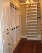 Light. Delicate. Simple. Soft.
– These are the terms association with some of the Sherwin-Williams colors with names like “Steamed Milk”, “Balanced Beige” and even “Non-Chalant White”.
This trend is also easy to incorporate into your environments with materials that you can readily find (similar to gray). Of course, there are always new spins on standard offerings, but the budget-friendly options can still give a nod to your fine design aesthetic.
Science Meets Fantasy
Not just influenced by “green design”, but influenced by “bio-design” (inspired by nature at the molecular level), this color trend “incorporates a merging of architecture, industrial design and art that integrate living systems” according to Sherwin-Williams. Their new paint options include “Library Pewter”, “Relic Bronze” and “Sealskin”.
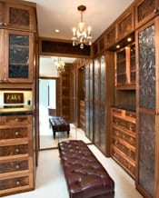
The pewter and bronze can be incorporated into custom storage solutions most readily through hardware (handles, hinges, accessories). Or, you could make a statement with one of these colors by selecting an on-trend material for your counter top surface. What I love about this idea is that you get the opportunity to select from the coolest material options with over-dosing on a trend.
 Cultural Ties
While America is often referred to as the “melting pot”, many of us embrace our roots and the culture in which we were raised. Honoring tradition and heritage through color is a great methodology. Colors include “Ceremonial Gold”, “Georgian Bay” and “Capri”.
The return of brass gives nod to this trend in terms of hardware, in both shiny and matte finishes, and includes several versions of oil-rubbed bronze. You can incorporate this into lighting fixtures as well.
So if you’d like to give a new “nod” to some of the space in your home – give us a call so we can come out and help you move in to what’s trending.

